Shopify
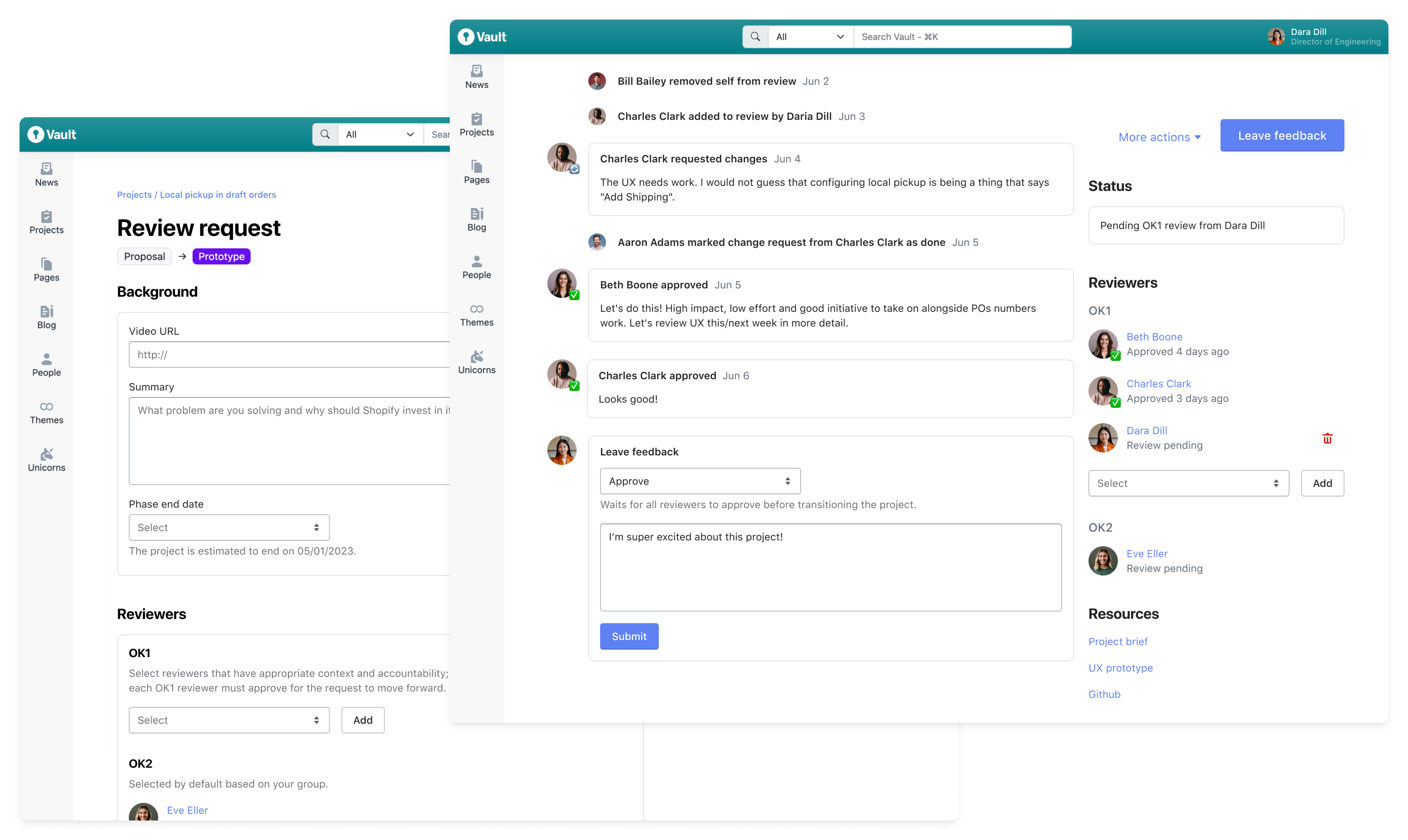
Shopify uses a custom project management and knowledge base tool called the Vault. All project work is tracked across four stages from Proposal to Prototype to Build and finally to Release. For a project to advance, it must be reviewed and approved by appropriate leaders within the company.
A tool that can't keep up
While effective as a single repository of project information, the Vault struggled as a tool for alignment.
In short, project reviews by company leaders took too long.
Rather than wait, teams often moved forward without critical feedback, risking valuable time and effort should their work not align with leadership's strategic vision.
As the lead designer on the Vault, I partnered with a team of 6 engineers over the course of 2 months to investigate this problem and redesign the project review process as a whole.
An opaque system
To get a more nuanced sense of what was hurting the review process, I interviewed 14 company leaders in 10 days. In these remote moderated sessions, I asked opened-ended questions to collect broad feedback in addition to showing specific pages to assess usability. I summarized my findings into 3 main areas of frustration.
Workflow
Reviewers needed a more discrete way to request changes; a simple yes or no wasn't adequate.
Awareness
Reviewers often questioned if the right people saw the project.
Speed
Reviewers couldn't say for sure as to why reviews took so long.
Optimizing for speed and accountability
Our goals reflected a focus on minimizing the time it took for projects to be reviewed and transitioned from one phase to the next.
- Decrease time between review open and closed to 7 days
- Decrease reviewer response time to 4 days
- Increase reviewer response rate to 95%
Designing quickly
At the outset, the most obvious change to the review experience was to add a third option for reviewers to Request changes. This would discretely put accountability back on project champions and make it clear that the review needed revisions before moving forward.
In terms of domain model, our team lead proposed a system that largely removed automatic reviewer assignments. Instead, project champions and other reviewers should be able to add and remove anyone at the company to review projects. This would promote accountability; all assigned reviewers were expected to take action or be removed.
Anchored by these changes, I explored several different ideas. With speed a priority and without a robust design system, I worked in wireframes.
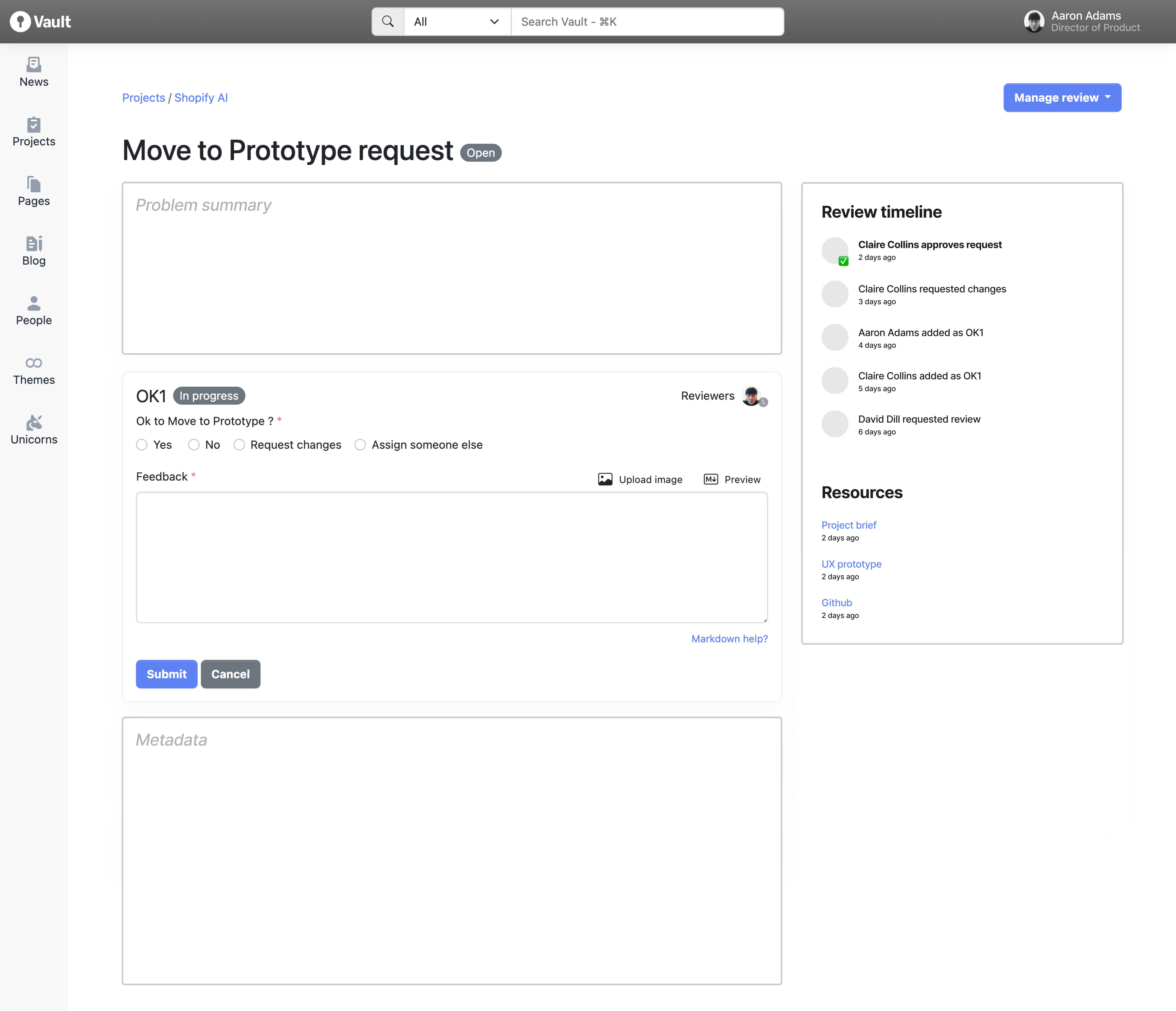
Initial wireframe with additional radio buttons and review timeline.
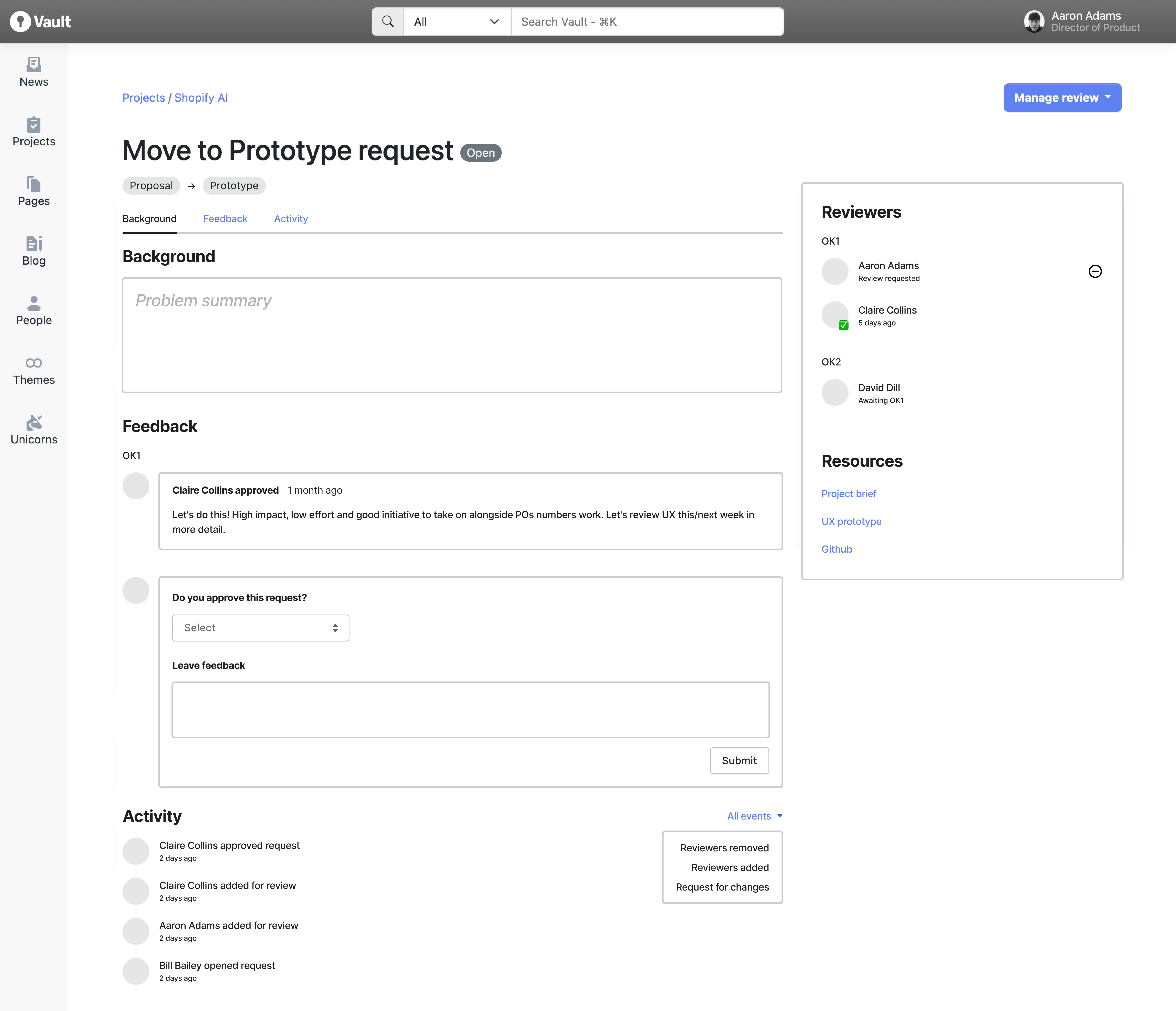
Follow up wireframe with list of reviewers and tabs for jumping to page sections.
A single timeline
From a design perspective, one of the primary drawbacks of the current experience stemmed from the scattering of important actions. Reviewers had to interact with one area to review the project, another area to comment, and still other areas to pause and pre-approve. Interpreting everything and taking action required excessive jumping and cognitive load.
Based on conversations with other designers and our team lead, I pursued a single timeline of events.
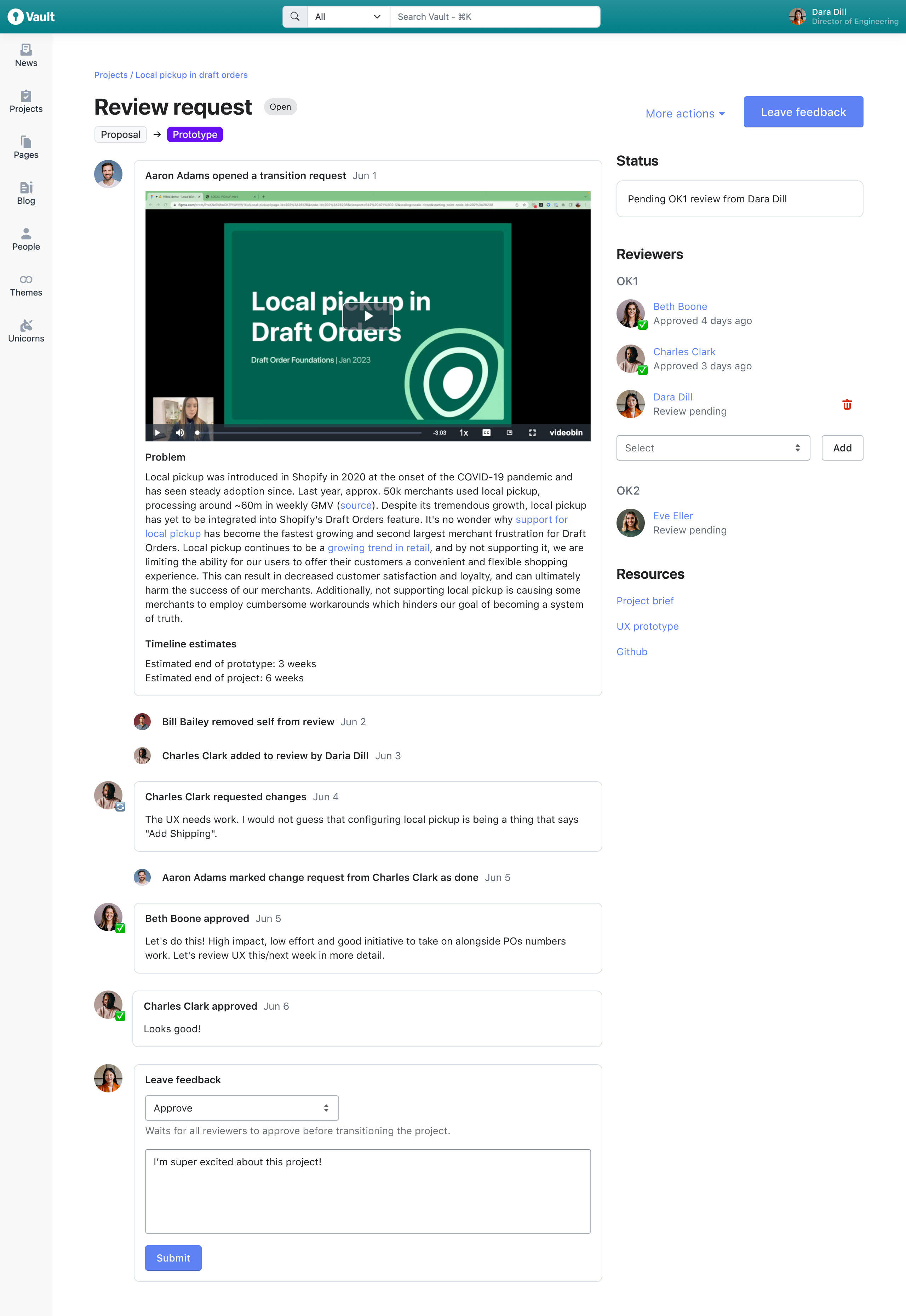
Final design that pairs a single review timeline and feedback box with an editable list of reviewers.
In the new design, reviewers can read through a consolidated history of feedback and events before leaving their own feedback. All related actions are combined into one box.
In terms of accountability, the right rail prominently displays the status of the review and the reviewers assigned. Should a reviewer not be included in the review, they can easily be removed, skipping the timeline content entirely.
Resource links are pulled out for reviewers looking to dig deeper into specific deliverables. In my interviews, several reviewers expressed dismay that they had to hunt for this information.
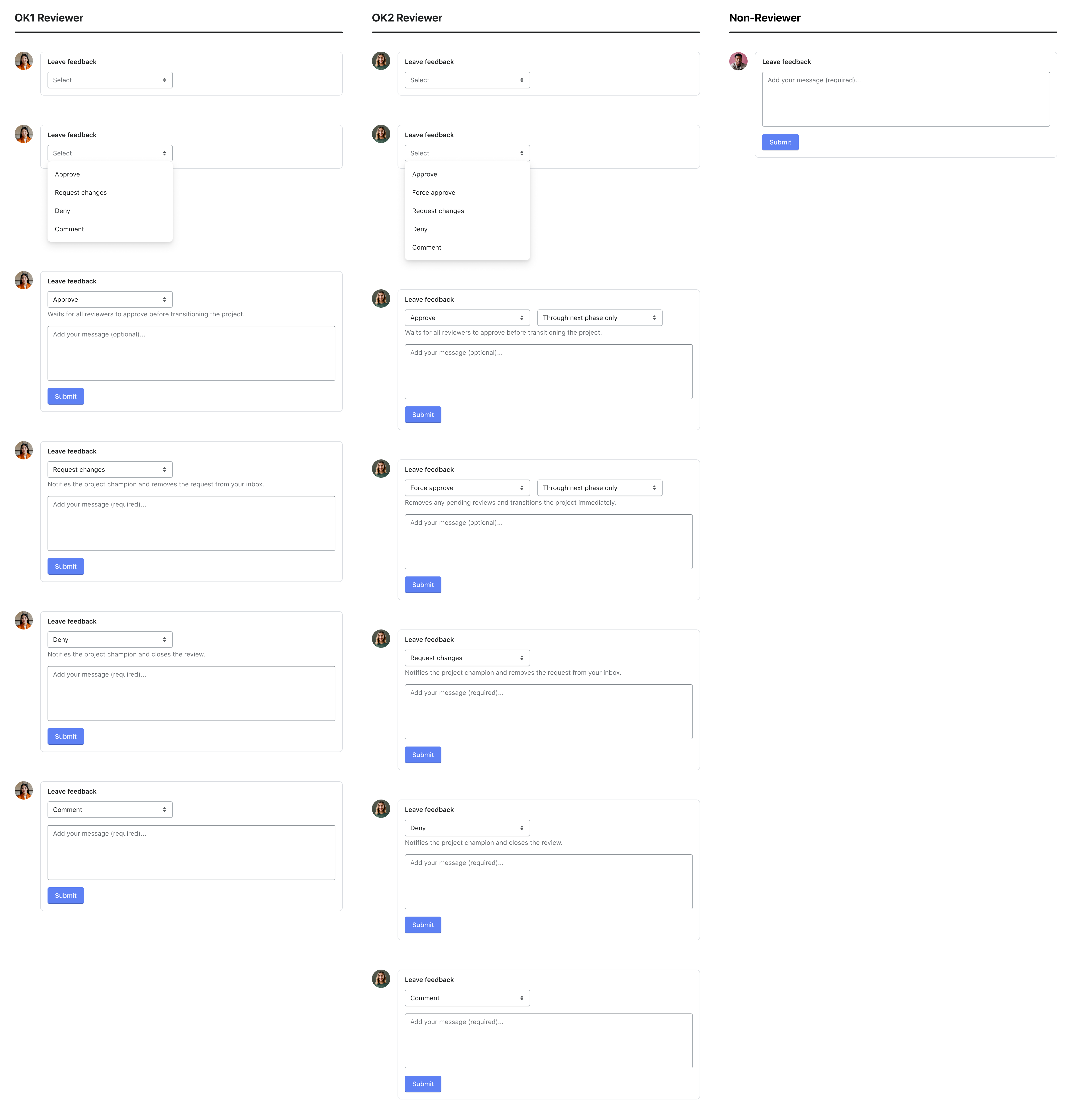
Senior company leaders known as OK2 Reviewers are able to approve projects through multiple phases and advance projects immediately with a Force approve.
Because actions within the feedback box are role dependent, I made sure to design each state, suggesting specific helper text to clarify each action.
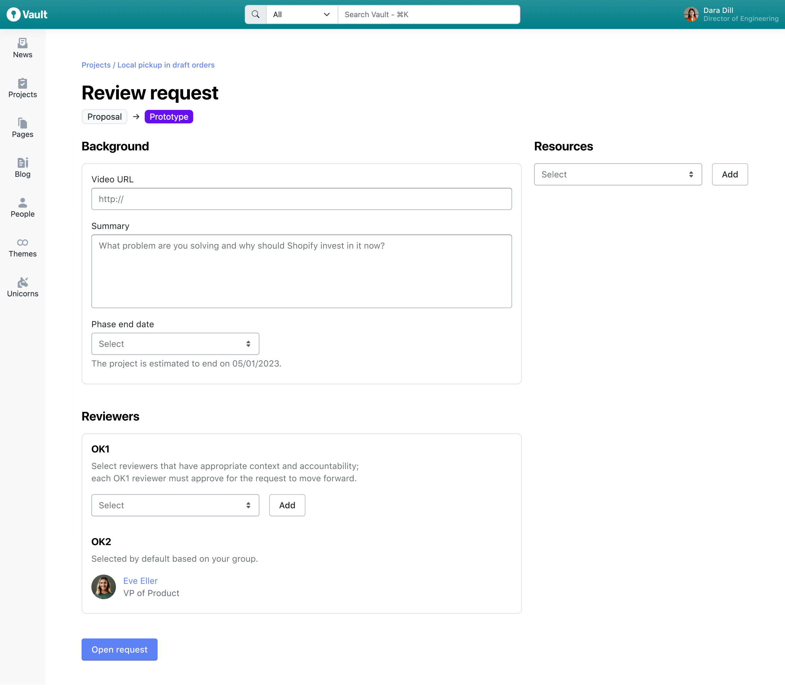
When opening a review, project champions are free to add any number of reviewers and project resources.
Within a week of launch, metrics showed clear improvement in review speed.
