UrbanStems is a startup intent on uprooting the multi-billion dollar flower industry. Unlike traditional online flower retailers, UrbanStems is vertically integrated. Bouquets are arranged at the farm, shipped to distribution centers, and delivered to recipients within hours of the order.
In the summer of 2017, I joined UrbanStems as the sole Product Designer. Drawing on my UX background, I influenced nearly all aspects of the digital customer experience. From homepage and storefront to checkout and email follow up, it was my responsibility to design and often build key customer touchpoints, incorporating research and user testing whenever possible.
Identifying an Opportunity
UrbanStems has loyal customers. They love the style of the flower arrangements as well as the convenience that comes with on-demand ordering. Over time, many end up sending bouquets several times over, often to the same loved one or even to themselves.
Given this behavior and the high value of repeat customers, we decided to launch a subscription service. Rather than require bouquets be purchased individually, customers could choose a single subscription and get multiple bouquets delivered on a regular schedule. Subscriptions, we theorized, would make repeat buying even easier and, more importantly, increase the average value of each purchase.
Work on subscriptions was a collaboration among our design, engineering, and business teams. Alongside Co-Founder and Creative Director Scott Simpson, I helped refine the definition and scope of the project, focusing primarily on UX and visual design activities in addition to user testing.
Building a Shared Understanding
To start, what would this service look like functionally? Beyond a regular order, what was the minimal amount of information needed to send a subscription? We zeroed in on frequency and duration. If we captured how often a customer wanted to send flowers (frequency) and for how long (duration), we could define a basic subscription order. Ideally, we could also offer subscription tiers corresponding to bouquet size.
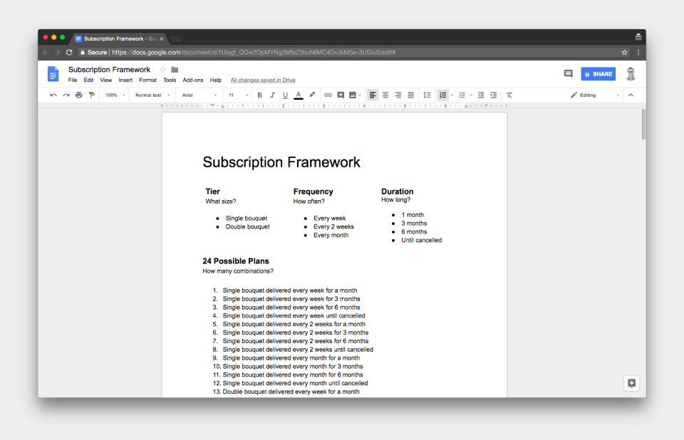
A summary of possible subscription plans. Not all combinations are practical.
While exhaustive, I knew that 24 subscription combinations was too much. It was overkill for an initial version and, depending on how it was presented, potentially overwhelming to our users. We pushed forward knowing this would be an important issue to address.
Designing for Efficiency and Consistency
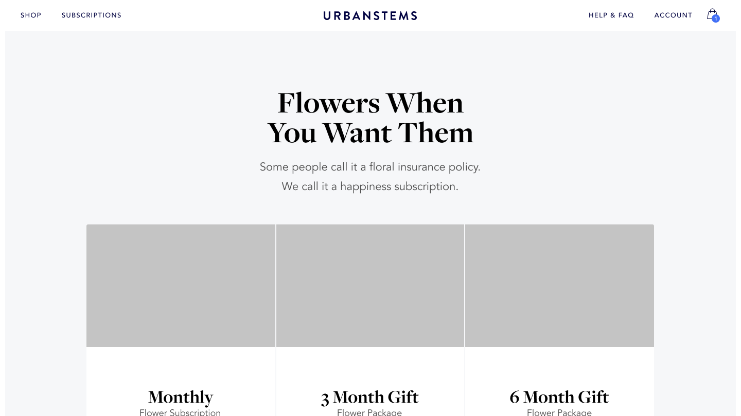
Translating this definition to an online experience was our next challenge. Crucially, we needed to present what a subscription was, how it worked, and, above all, why it was worth the cost. Following several whiteboarding sessions, we landed on an initial version.
The subscriptions wireframe focuses on three plans.
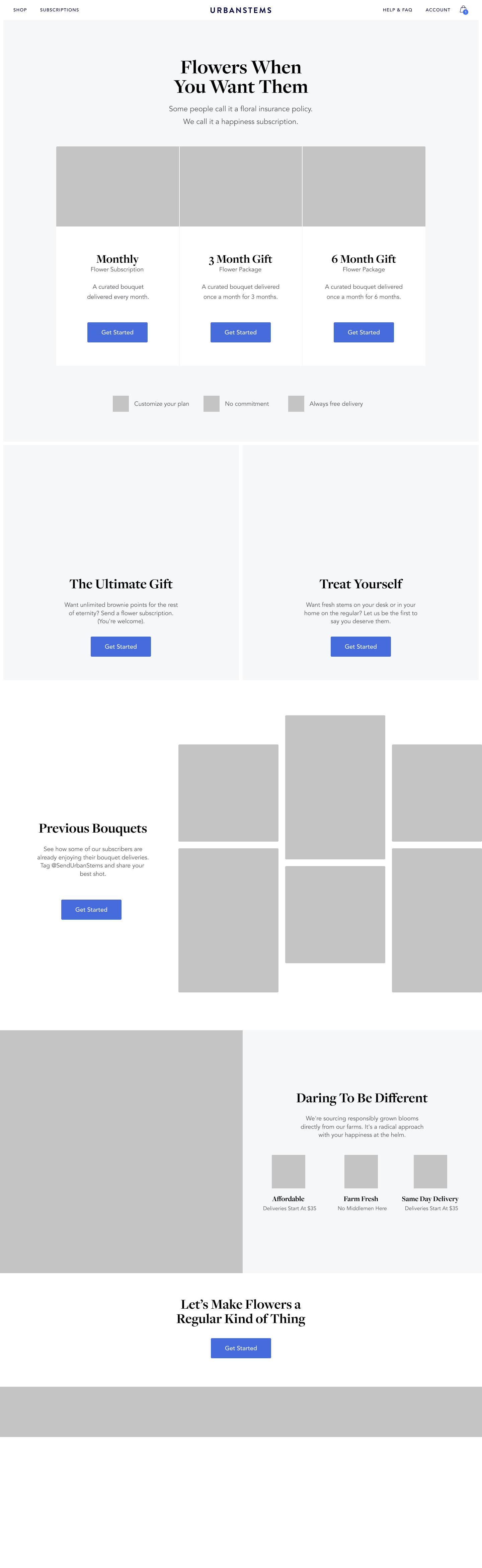
Independent of what plan is selected, customers can customize their subscription in the basket.
Fundamentally, the design consists of two parts — the landing page and the basket. The landing page summarizes the offering, incorporating marketing language with more basic details. Hitting any button on the page brings in the basket where users can confirm or adjust preselected subscription settings.
This structure was valuable for several reasons. It reuses our form, basket, and checkout components, simplifying development and ensuring a consistent user experience. In addition, it avoids listing every possible subscription option. Instead, three plans are featured, and users are one step away from accessing the remaining combinations in the basket. With time, data could help guide which plans were featured on the landing page.
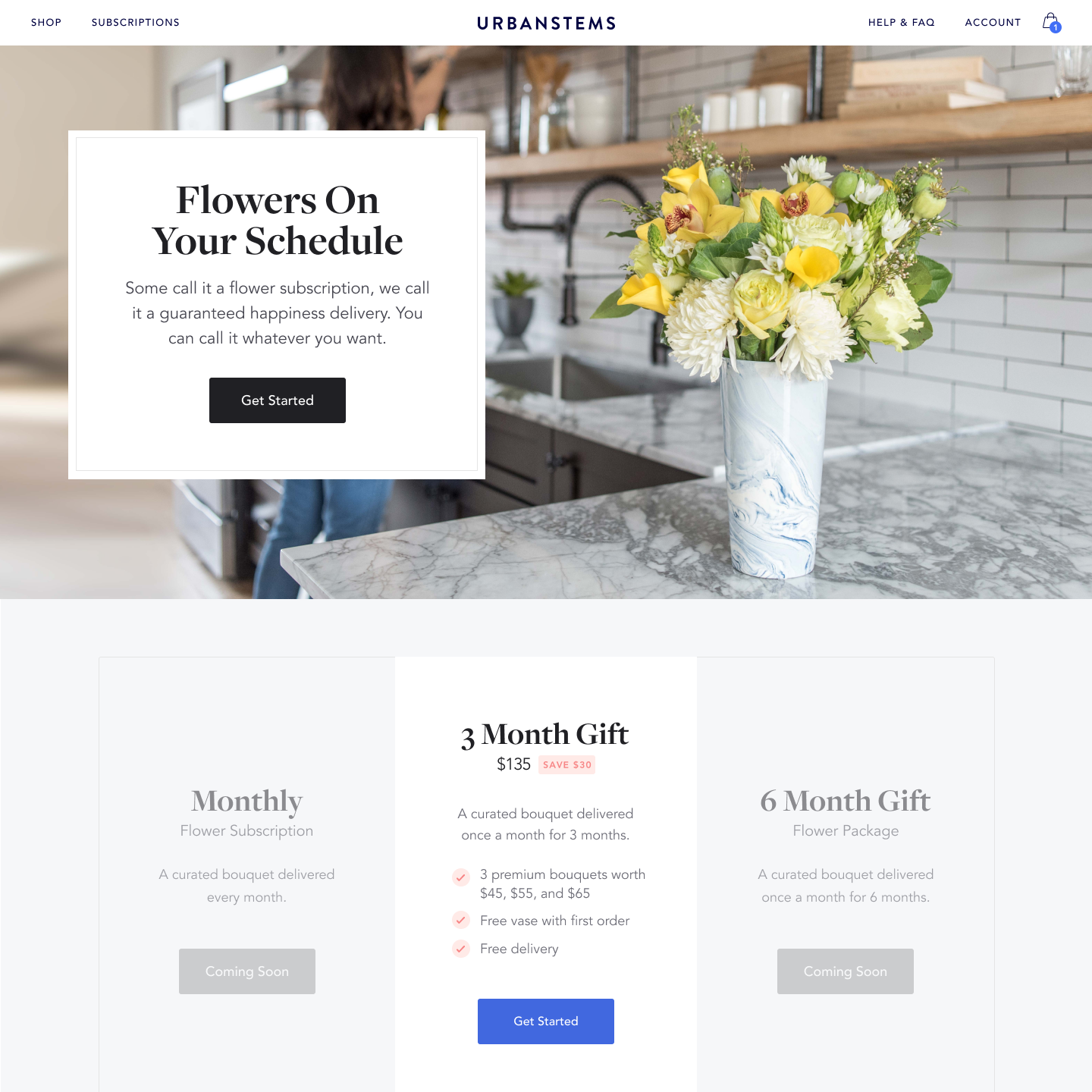
Final design mockup. We launched with a single plan due to operational constraints.
Collecting Feedback
Soon after the initial release, we started thinking about the next iteration. Early numbers for subscriptions ordered were below projections. Anecdotally, we started to hear from peers as well as our customer service team that the language on the landing page was confusing.
To get a more complete understanding, I set up a lightweight user study. Within a week, I interviewed 6 customers, offering UrbanStems account credit in exchange for a 30 minute video call and screenshare.
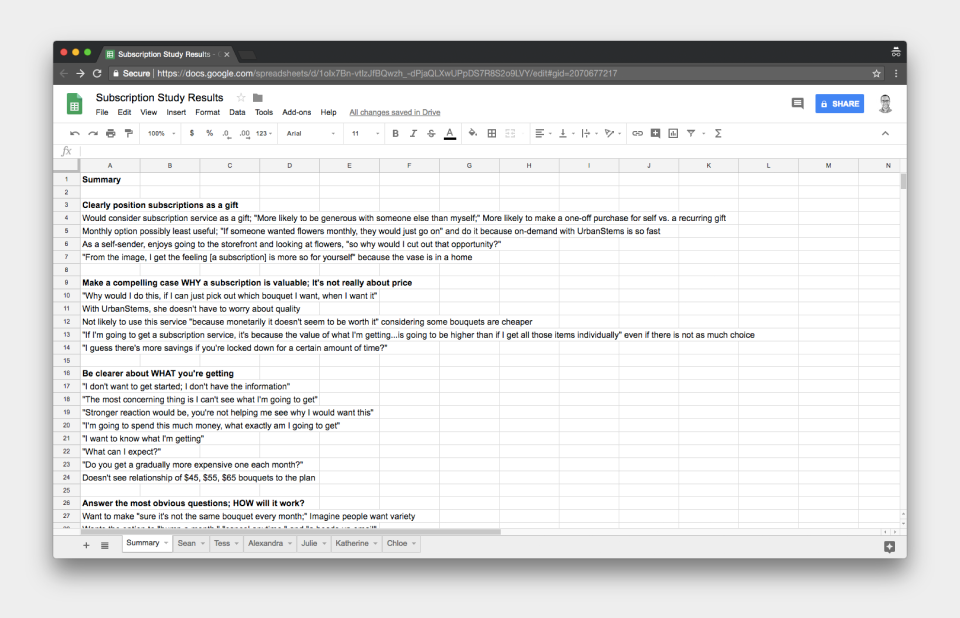
Compilation of feedback sourced from 6 user interviews.
Simplifying the Messaging
In the first version of the subscriptions landing page, we attempted to appeal to two audiences — customers who wanted to send a one-of-a-kind gift as well as customers who wanted regular, fresh flowers for their home or office. Unfortunately, I think considering both equally produced a muddy message.
For our next iteration, we focused entirely on sending a subscription as a gift. Instead of presenting discrete plans, we focused on how subscriptions worked using a traditional three step process. To end the page, we explicitly address some of the questions we gathered in our user interviews.
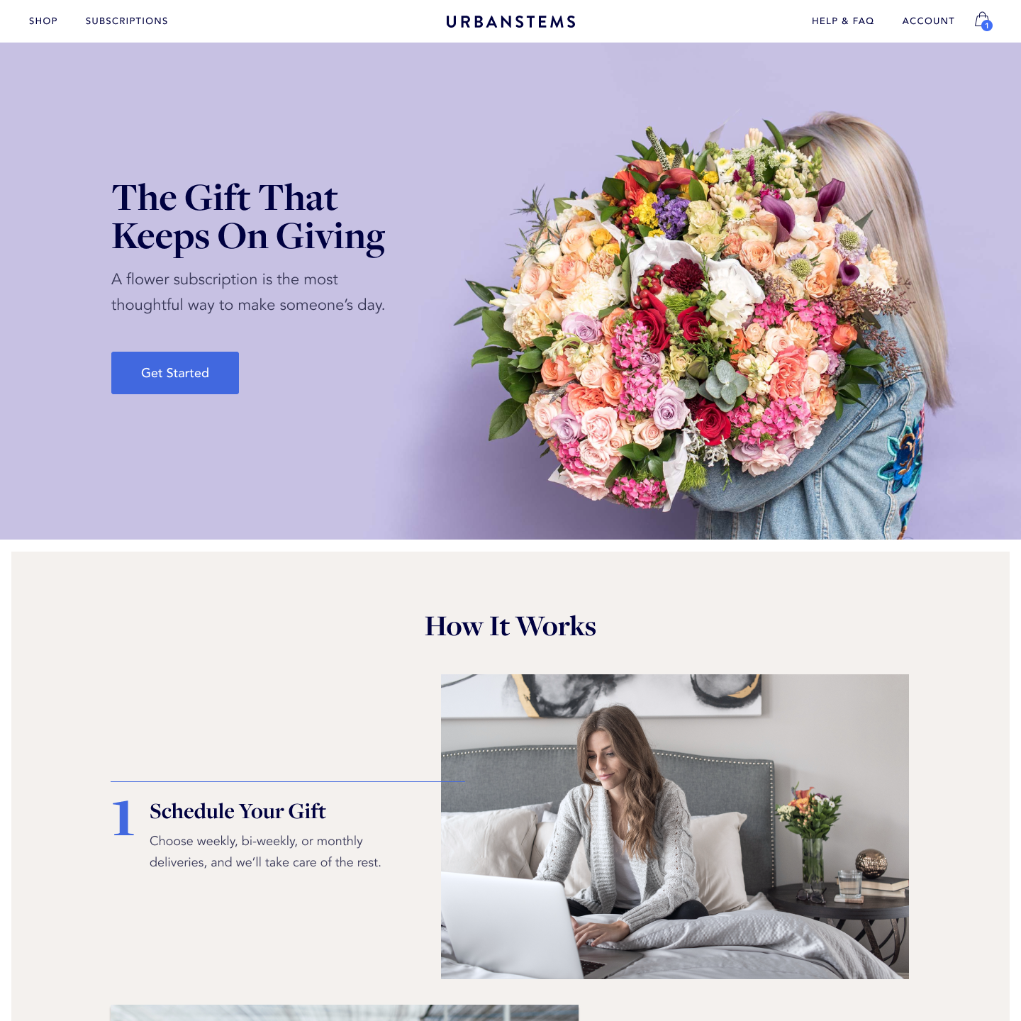
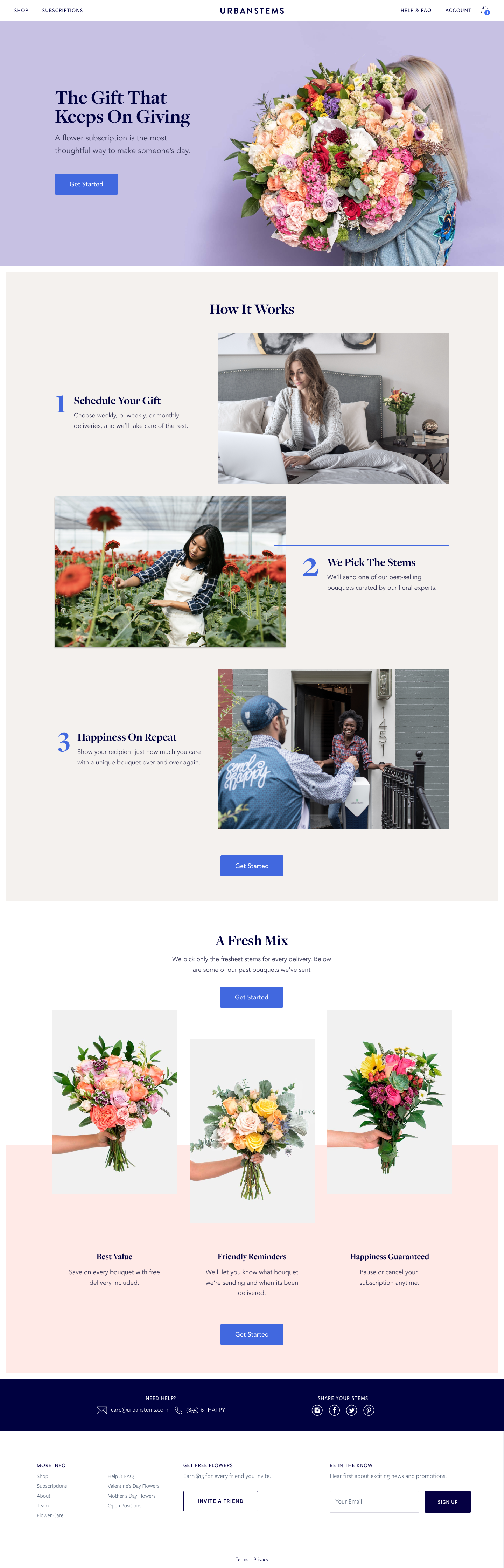
The second iteration focuses on how the service works.
Considering the Context
Along with refreshing the landing page, we took the opportunity to make sure other areas of the website pointed to subscriptions. Most notably, we included a promo section at the bottom of the storefront. Customers in the buying mindset now encountered subscriptions next to our regular product lineup.
Additionally, once customers added an eligible bouquet to their basket, they now saw an upsell component. Simply checking a box allows customers to quickly convert their single bouquet into a subscription plan without leaving the checkout flow.
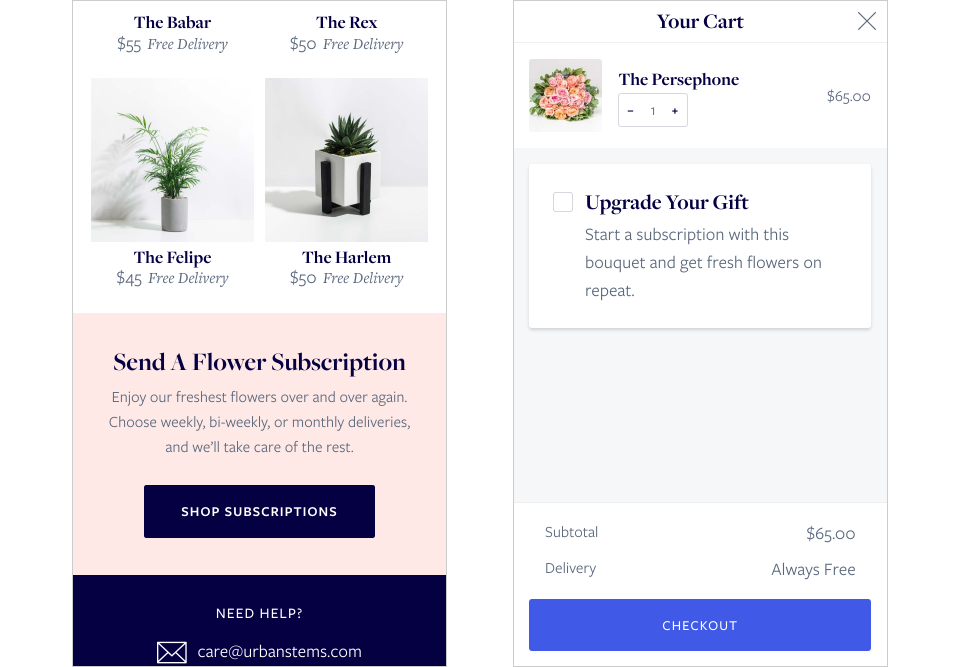
Subscription references were added to the storefront and basket.
Wrapping Up
As is true so often in design, rarely do you hit the target exactly on the first try. The key, of course, is to keep learning and iterating. With our second release, the rate of subscription purchases increased and our customer service team reported fewer incidents of confusion.